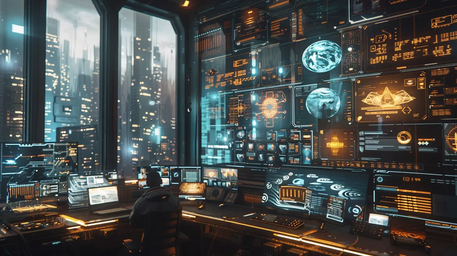
How to Use Visual Hierarchy in Game Interfaces
9 June 2025
Hey there, fellow gamer or aspiring game designer! Think about the last video game you played. Do you remember how natural it felt to navigate the menus? How you instantly knew where to click without breaking a sweat? That, my friend, is the magic of visual hierarchy in action. When done right, it’s like a well-choreographed dance — guiding the player’s eyes exactly where they need to go.
But hold on a second, what exactly is visual hierarchy? And how can you effectively use it to design chef's kiss game interfaces? Well, grab a seat, maybe a snack too, because this article is your one-way ticket to understanding why visual hierarchy is the secret sauce your game UI (user interface) needs.
What Is Visual Hierarchy?
Before diving in, let’s break it down. Visual hierarchy is like a game of “follow the leader” for your eyes. It’s the arrangement of elements to show their importance. Simply put, bigger, bolder, and brighter elements scream, “HEY! LOOK HERE FIRST!” while smaller, subtler ones whisper, “I’m important, but you can check me out later.”In game interfaces, visual hierarchy ensures players don’t feel overwhelmed by too many buttons, icons, or flashy effects. Instead, they feel guided — almost like you’re handing them a treasure map. This can make all the difference between a smooth gaming experience and a rage-quit situation.
Why Does Visual Hierarchy Matter in Games?
Let’s get real for a moment: if the menu in your game looks like a chaotic flea market, players are going to bounce faster than Sonic on caffeine. Nobody likes getting confused trying to find the “Start” button or digging through cluttered stats menus during an intense boss fight.A solid visual hierarchy delivers:
- Clarity: Players instantly know what’s important.
- Speed: Decisions happen faster — no one likes wasting time figuring out where the inventory is.
- Engagement: An intuitive UI keeps players immersed in the game, not in frustration.
Think of your game’s interface as a tutorial level — it should teach players how to interact with it without saying a word.
Key Principles of Visual Hierarchy in Game Interfaces
Now that we’ve hyped up visual hierarchy, let’s tackle the how. Here are the core principles that’ll have your game UI looking slicker than a freshly polished sword:1. Size Matters (A Lot)
Big things naturally grab our attention first, right? A towering boss is scarier than a tiny minion, and this applies to UI too. Make primary elements like the “Start Game” button larger than secondary options. Your players shouldn’t need Sherlock Holmes to figure out where to go.For example, in shooter games, the ammo and health indicators are usually front and center, with large, bold numbers. Why? Because these two things are life-or-death!
2. Contrast: Make It POP!
Without contrast, your game interface would look flatter than an old CRT screen. Use contrasting colors, fonts, or shapes to highlight important elements. For instance, the quest tracker in RPGs often stands out with bright or glowing text, so you can’t miss it.Pro Tip: Be careful not to go overboard! Too much contrast can feel like staring at a neon billboard at midnight. Balance is key.
3. Positioning: The Prime Real Estate Rule
Ever wondered why menus and buttons are usually at the top, center, or bottom of the screen? That’s because those spots are prime real estate for the human eye. Place key elements where players naturally look first.In strategy games like RTS (real-time strategy), resource counters are often at the top-left corner. Why? Because your eyes automatically drift there as you plan your next move.
4. Use of Color: Set the Mood
Colors do more than make things pretty — they set the tone and guide attention. Warm colors like red, orange, and yellow scream, “Urgent!” (think low health alerts). Cool colors like blue and green are more chill and are often used for confirming selections or showing idle states.Hot Tip: Use a limited color palette. Nobody likes a UI that looks like it’s been hit by a rainbow explosion.
5. Typography: Speak Their Language
Fonts are the silent heroes of a good game interface. Bold, clean fonts should be reserved for important headings (think “Game Over” or “Victory”). Use smaller, more subdued fonts for secondary information like flavor text or tooltips.And for the love of all things pixelated, avoid overly fancy fonts that are hard to read. Comic Sans, I’m looking at you.
6. Grouping: Birds of a Feather, Stick Together
Humans love patterns. When items are logically grouped together, it’s easier for players to process information. For instance, in RPG menus, equipment stats are usually grouped together, while character skills sit in another section.This principle is like organizing your inventory in a survival game. Weapons go in one slot, healing items in another. Chaos? Ain’t nobody got time for that.
7. Motion for Attention
Animations can work wonders in drawing the player’s focus. For example, a blinking icon can signal an unread message, or a pulsating button can scream, “Click me!”Just don’t overdo it. Too much movement can feel less like a polished game and more like a chaotic fireworks show.
Examples of Great Visual Hierarchy in Games
Want to see visual hierarchy done right? Here’s a quick hit list of games that totally nailed it:- Fortnite: Its HUD (head-up display) design ensures critical info like health and shield is never out of sight, and its bright, bold colors guide players effortlessly.
- The Legend of Zelda: Breath of the Wild: This masterpiece keeps the UI minimal, but each element is placed with care, making exploration feel natural.
- Elden Ring: Despite its complexity, the menu design groups similar elements together and uses size and contrast to make navigation surprisingly smooth.
Tips for Implementing Visual Hierarchy in Your Game Interface
Ready to roll up your sleeves? Here are some actionable tips for designing a killer UI:1. Prototype First: Before adding fancy graphics, sketch out your UI layout. Test it with some friends or colleagues to see if it "clicks."
2. Think Like a Player: Always ask yourself, “Where would I naturally look first?”
3. Test on Different Devices: Your layout may look awesome on a PC, but what about a smaller screen like a Nintendo Switch or smartphone?
4. Iterate and Refine: Even the best designers don’t get it perfect on the first try. Gather feedback and tweak as needed.
Common Mistakes to Avoid
Of course, we can’t talk about the do's without a quick peek at the don’ts. Avoid these pitfalls like a bad quick-time event:- Overcrowding: Too much info in one place is overwhelming. Give your elements room to breathe!
- Unclear Hierarchy: If everything screams for attention, nothing gets noticed.
- Ignoring Accessibility: Always consider colorblind players or those using smaller screens. Accessibility = inclusivity.
Wrapping It Up
Visual hierarchy in game interfaces is the unsung hero of smooth gameplay. It’s what makes players feel at home the moment they boot up a game. By using size, contrast, color, and positioning effectively, you can guide players effortlessly through even the most complex menus or HUDs.So whether you're designing a gritty sci-fi shooter or a cozy farming sim, remember this: A great UI isn’t just about looking cool — it's about making players feel understood. Treat your UI like a friendly guide who whispers, “Hey, I’ve got your back.
all images in this post were generated using AI tools
Category:
Video Game DesignAuthor:

Whitman Adams
Discussion
rate this article
3 comments
Uri McCall
Clear tips, great insights!
June 22, 2025 at 2:34 AM

Whitman Adams
Thank you! I'm glad you found the tips helpful!
Maggie McLaughlin
Visual hierarchy? Oh, you mean that magical tool that stops players from mistaking the pause button for the exit? Groundbreaking stuff!
June 12, 2025 at 5:00 AM

Whitman Adams
Absolutely! Visual hierarchy is essential for clear navigation and preventing confusion in game interfaces. It's more than just aesthetics; it enhances the player experience by guiding their attention effectively.
Xeno Wilson
“Visual hierarchy: because even pixels deserve a royal ranking!” 🎮👑
June 9, 2025 at 4:54 AM

Whitman Adams
Absolutely! Visual hierarchy is key to guiding players' attention and enhancing their experience. 👾✨


